Graphic Design Fundamentals (The Non-Designers Guide to Designing Like a Pro)
Beginning Graphic Design: Fundamentals of Design Line, Shape, Form, Texture, Balance
Design is the process of creating something new or modifying existing things. Good graphic design makes products easier to use and increases user satisfaction. Designers develop products that solve problems, improve life, and enhance our lives. The designer must understand how people think and act, what motivates them, and how they interact with technology. A designer should be creative, organized, flexible, and analytical. They must also be detail-oriented and have an eye for aesthetics.
Line, color, shape, text, image, and space are the main components of graphic design. These elements are used to create an effective graphic design.
This article covers graphic design basics, including typography, layout, illustration, photography, coloring, and composition. You’ll learn about design elements, such as line, shape, texture, and space. You’ll also explore design principles, such as contrast, repetition, hierarchy, unity, and balance.
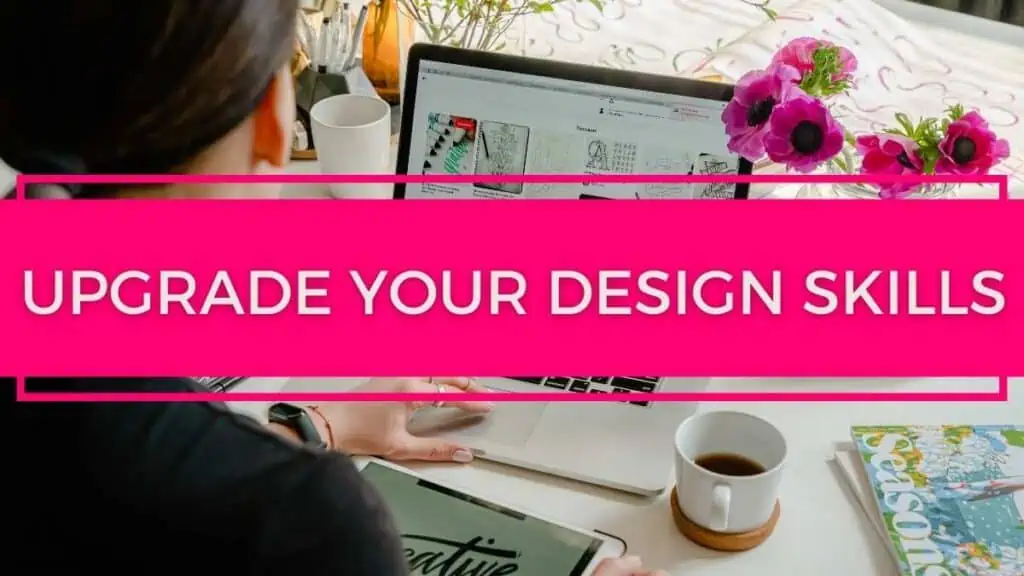
Upgrade Your Design Skills
Graphic Design basics include line, shape, color, and texture. These are the basic elements of any design project. Line is used to create shapes, such as circles or squares. Shape is used to draw attention to an object or idea. Colors are used to make objects stand out. Texture is the surface quality of an object. Type is used to communicate ideas. Space is how much room there is around an object. Finally, images are used to convey ideas visually.
Red, yellow, and blue make up primary colors. Mixing these three colors together creates all sorts of different hues. This means that there are many ways to use these colors to represent something. For example, red could mean anger, while yellow could mean happiness. Blue could mean sadness, while green could mean contentment.
Tertiary colors are made by combining two primary colors. Secondary colors are made by mixing a primary and a secondary. The secondary colors are violet, green, and orange. The tertiary’s colors are red-orange, yellow-blue, and yellow-orange.
Textures are the feel of a surface. Graphic designers must use illusions to suggest how their works might feel if viewers could feel them. To master texture, they should work with organic textures such as leaves, tree bark, rocks, fur, flowers, and grass.
Textured patterns are used in this design. Typography is used throughout the design. A photograph is used as a background. Color saturation and transparency levels are adjusted.
Analogous color schemes use colors lying next to each other on the color wheel. Triadic color schemes use colors that have an even spacing around the color wheel. Split-complementaries use a base color and its complement. These are all great ways to create a sense of balance and harmony in your designs.
Weighty words are usually important words. Large or thick fonts convey importance. Thin fonts can convey elegance or modernity. Too many fonts can make a logo appear cluttered.
Tetradic schemes can be very versatile and creative. They are often used in interior design, graphics, fashion, and advertising. They are also very popular in web design because they add variety and interest to a page.
Square color schemes can be very versatile, but they need to be carefully planned out. They should always be balanced and not too similar to each other. Pastels tend to calm people down, but bright colors can make them feel happy. Darker shades can make people feel serious, but they can also make them appear dull and boring.
Color is an important part of our culture. We use colors to communicate certain emotions. For example, red means stop, blue means go, yellow means caution, green means safe, etc.
Grab Your FREE Mini-Course: Graphic Design Fundamentals You NEED to Know Here
Alignment is used in many ways in graphic design.
Alignment makes designs easier to follow, and the text flows smoothly. Designers should align-items so that they connect visually.
You can use it to make things easier to understand. For example, when you align text in a paragraph, it makes it easier to read because there is less space between words. In Microsoft Word, you can also use alignment to change the direction of your paragraphs. This is useful when writing emails or blog posts.
A line is a shape that connects two or more points. Lines frequently appear in designs because they give a feeling of movement and speed. Lines can be used to create a flowchart that guides the reader’s eyes from one element to another.
When using lines, remember that they can be used in many ways. Weight, color, style, and texture can make a huge difference in how something looks. Use these qualities when designing.
There are many different kinds of shapes. Some shapes have a clear, defined boundary, while others do not. Regular shapes include rectangles, squares, triangles, circles, ellipses, arcs, etc. Organic shapes include irregular polygons such as hexagons, octagons, and decagons.
Shapes are very important in design. Look for them in other designs, and soon you’ll see them everywhere.
A sculpture is an object that shapes clay or another material into the desired shape. Sculptures are often used as decorations and art pieces. Architecture is any building structure. Three-dimensional objects include statues, buildings, bridges, etc. Two-dimensional designs include drawings, paintings, illustrations, etc.
Shadows are used to indicate form and give an object a sense of place. Simple shadows can also be used to add more realism to our work.
A cactus in a shiny pot has an exciting texture. It looks like it could be made out of metal. The texture makes it look more realistic than other objects like a plastic toy.
Don’t make your graphic too busy or complicated. Keep them simple and easy to understand.
Asymmetrical designs look balanced because the elements appear to be the same on both sides. This design is visually appealing because the elements are evenly distributed. Asymmetric design is used to call attention to the right things.
Grid
Using a consistent grid system allows designers to place similar elements next to each other, creating a sense of continuity. Repetition helps people recognize that objects belong together. In packaging, each product has a unique shape, but they are all the same size. The logos are positioned similarly, and they use the same typeface. All products are made of the same material.
Hierarchy
Hierarchy creates organization. Think about it, and hierarchy is usually something we consider when describing rank in a business or organization like politics and the church. It’s a system in which people or things are arranged according to their importance. In design, hierarchy creates a visual organization to a design and gives the reader an impression of where to start and end reading. Each element that’s part of the design can have a ranking of priority. For example, headline.
Website Call To Action. Body Copy.
Designers should design according to hierarchy. Clients may ask designers to increase the size of many elements on the page because they think everything is really important. But if everything is equally important, nothing stands out anymore. Usually, there is a single message or piece of information that is more important than other pieces of information. This piece of information should be highlighted the most and will lead audiences into the rest of the website.
A hierarchy is used in these posters and postcards, where the artist and date are shown first, followed by the title, then the location, and finally the price. The packaging uses a similar hierarchy, but instead of being grouped into categories, the products are separated into different sections.
A hierarchy in packaging is so important! The consumer needs to be drawn in. This is achieved by using a strong focal point. The consumer needs to know exactly what they’re buying. Typography is used to highlight the main points. The hierarchy of the copy is very clear.
Typography – The Basics of a Typeface and Character Spacing
Typography
Typography is the art of arranging type elements in an aesthetically pleasing manner. This resource provides definitions and explanations of common typographic terms.
Symmetrical balance can be seen as a yin-yang symbol. Leonardo Da Vinci’s The Last Supper shows a perfect example of this type of balance.
The identity works well because it shows that this company is reliable and professional. The layout is simple but effective. The logo uses symmetry and balance to make it look more appealing. The positive copy is placed on the top left side of the design. The negative space is also used effectively. The
Five Principles of Graphic Design
The five principles of graphic design are the underlying basis for all visual communication. They provide a framework that allows designers to create effective and meaningful images, whether they’re used in print or onscreen. The principles are:
1. Readability – making sure that your audience can understand what you want them to read
2. Legibility – making sure that your text is easy to read
3. Memorability – making sure that the words and pictures stick in your mind long after you’ve finished reading or viewing
4. Coherence – ensuring that your work makes sense within its context
5. Controllability – allowing you to change the way someone else interprets your work
Graphic Design Software Options
What is Gimp?
GIMP (GNU Image Manipulation Program) is a free, open-source raster graphics editor for Linux and other Unix-like operating systems. It can be used to edit images in various formats including GIF, JPEG, PNG, TIFF, PDF, EPS, PSD, BMP, CXF, PICT, PCX, Targa, CUR, and others. It was originally developed by Spencer Kimball and Peter Mattis at Massachusetts Institute of Technology. GIMP has been downloaded over 100 million times since its release in 1995. GIMP is available for Windows, Mac OS X, GNU/Linux, etc.
What is Canva?
Canva is a free online tool that makes it easy to create professional-looking graphics, such as business cards, posters, and flyers. It’s also great for creating social media images, like Instagram posts or Facebook covers. You can use your own photos or choose from a library of high-quality stock images.
What is Easil?
Easil is a free, open-source, cross-platform, and easy to use tool for creating and managing your own website. It’s the easiest way to create and manage websites on Windows, Mac OS X, Linux or any web server. Easil is based on PHP and MySQL. It supports all major browsers and platforms, including mobile devices.
What is Vista Create? (Previously Crello)
Crello (now Vista Create) is a social network that allows you to create your own profile, share content and connect with other people. You can also use it as a way of keeping in touch with friends and family. It’s free to join, but there are some paid features which include: unlimited storage, private messaging, custom domain name, etc.
What is Visme?
Visme is a free online tool for designing modern websites and landing pages. It includes templates, fonts, illustrations, icons, and animations. There are two versions – one for desktop computers and another for mobile phones.
What is Adobe Photoshop?
Adobe Photoshop is a vector graphics editing software package designed primarily for photo retouching and image composition.
What are Adobe InDesign, Illustrator, and Photoshop?
Adobe InDesign is a page layout program that allows you to create professional-looking documents. It can also be used to make brochures, flyers, newsletters, magazines, catalogs, books, etc. The program has many features including text formatting, typography, tables, charts, layouts, styles, grids, illustration tools, effects, animation, video, audio, and much more.
Illustrator is an art creation application that lets you draw, paint, type, and manipulate digital artwork. It can help you create logos, banners, buttons, t-shirts, book covers, magazine ads, packaging, and more.
Photoshop is a powerful image manipulation program that gives you control over every aspect of your picture.
What is Affinity Publisher?
Affinity Publisher is a low-cost desktop publishing software that allows you to create professional-quality publications. It supports the creation of books, magazines, newsletters, brochures, and more. You can use it for personal or commercial projects.
What Is PicMonkey?
Picmonkey is a free online photo editor. It allows you to edit your photos in an easy and fun way, without having to learn complex editing techniques. You can use it to make simple changes like crop, rotate, add text or filters, adjust brightness/contrast, apply special effects, etc.
What is Pixlr?
Pixlr is a free online photo editing app that offers basic editing functions such as cropping, rotating, adjusting color balance, adding borders, frames, and watermarks, etc.
Different Types of Design
- Visual identity graphic design
- Marketing & advertising graphic design
- User interface graphic design
- Publication graphic design
- Packaging graphic design
- Motion graphic design
- Environmental graphic design
- Art and illustration for graphic design
What is Typography?
Typography is the art of arranging type in a way that makes it easy to read and understand. It’s about how words are arranged on a page, whether they’re set in all caps or lowercase, what size font they’re printed in, and how many lines of text there are.
Typography also includes things like calligraphy and handwriting.
Why is typography so important?
When used correctly, typography can make your content more visually appealing and memorable. It can help you convey information effectively, and it can even increase engagement.
What Are The Different Types Of Typography?
Typography is the art of arranging type on a page. There are several types of typography, including:
1. Display Type
2. Body Copy
3. Headline Type
4. Callout Type
5. Caption Type
6. Subhead Type
7. Tag Line Type
8. Quote Type
9. List Type
10. Paragraph Type
11. Photo Type
12. Slideshow Type
13. Infographic Type
14. Icon Type
15. Banner Type
16. Button Type
17. Image Type
18. Map Type
19. Slide Type
20. Table Type
21. Video Type
22. Web Page Type
23. Word Document Type
24. Email Type
25. Brochure Type
26. Poster Type
27. Magazine Type
28. Book Cover Type
29. Newspaper Type
What is Color Theory?
Color theory is the study of how colors are perceived by humans and other animals. It’s also a science that has been around for thousands of years, but it wasn’t until the 19th century that scientists started to really understand color perception.
Color theory was popularized in the late 1800s by artists such as Wassily Kandinsky, Paul Klee, and Piet Mondrian. They were inspired by the work of Johann Wolfgang von Goethe and Charles Darwin. In fact, Goethe wrote a book called “Theory of Colours” in 1810.
In this article, we’ll explore the basics of color theory and show you how to apply it to your designs. We’ll cover everything from RGB color models to complementary and triadic color schemes. By the end of this tutorial, you’ll be able to select colors that complement each other and create harmonious color combinations.
RGB vs CMYK
There are two main ways to represent colors on computers: RGB (red, green, blue) and CMYK (cyan, magenta, yellow, black). When using RGB, every pixel contains three values: red, green, and blue. These values determine the intensity of the color. For example, a pixel with 100% red would look completely red; a pixel with 50% red and 50% green would appear half-way between red and green.
CMYK works differently. Instead of having three values for each color, CMYK uses four values: cyan, magenta, yellow and black. Cyan represents the amount of blue in the color. Magenta represents the amount of red. Yellow represents the amount of green. Black represents the absence of any particular color.
CMYK is used in printing because ink doesn’t mix very well with RGB. This means that if you print an image using only RGB, the colors may not turn out exactly as expected. However, since CMYK is based on the way light interacts with objects, it can accurately reproduce colors even though they don’t exist in nature.
How Do I Choose a Color Scheme?
Choosing the right color scheme is crucial to creating a cohesive web design. You need to consider several factors before choosing a color palette:
- 1. What mood or feeling do you want to convey?
- 2. How does the color affect your audience?
- 3. Do you have enough space to use all the colors?
- 4. Does the color scheme match the rest of your website?
- 5. Is there any specific brand identity that needs to be reflected?
- 6. Are you trying to achieve a certain effect?
- 7. Can you find a free stock photo or icon that matches the color scheme?
- 8. Will the colors help users navigate through your site more easily?
- 9. Does the color scheme fit with your overall branding strategy?
- 10. Have you considered accessibility issues?
- 11. Is the color scheme aesthetically pleasing?
- 12. What about the color wheel?
- 13. Do you like the color?
- 14. Is it easy to read?
- 15. Does it make sense?
- 16. Does it reflect who you are?
- 17. Is it representative of your company?
- 18. Does it match what you sell?
- 19. Is it consistent throughout your site?
- 20. Is it unique?
- 21. Is it memorable?
What Is Contrast In Graphic Design?
Contrast in graphic design can be defined as the difference between two or more colors, tones, values, textures, and lines. It’s a very important aspect of any good design because it helps to create balance and harmony within an image.
Contrast is measured by dividing one value by another. If the ratio is 1:1, then the contrast is perfect. A ratio of 2:1 creates a moderate level of contrast while a ratio of 3:1 creates high levels of contrast.
The most common types of contrast are:
- Color
when the same hue is used but different intensities, such as dark vs. light gray
- Value
when a lighter tone is placed over a darker area, such as white text over a black background
- Texture
when similar materials are combined, such as wood grain and metal
- Line
when thick and thin lines are contrasted against each other, such as thick and thin strokes
- Space
when large areas of solid color are juxtaposed against smaller shapes and patterns
Why Should I Use Grayscale Images?
Grayscale images work best for websites that offer information rather than products. They also work well for logos and icons. Since grayscale images lack color, they tend to look cleaner and simpler.
What is Balance In Graphic Design?
The term “balance” in graphic design refers to the visual harmony of composition. It is not just about balancing colors or shapes, but also about creating a balance between different elements within a single image. Balance can be achieved by using complementary colors (opposite hues), analogous colors (similar hues on opposite sides of the color wheel) or split-complementary colors (a combination of both).
Complementary Colors
Complementary colors are opposite on the color wheel. For example, red and green are complements. When these colors are mixed together, they cancel out each other. This means that their brightness will decrease.
Analogous Colors
Analogous colors are next to each other on the color wheel. Red and orange, blue and purple, yellow and green, etc., are all examples of this type of color relationship. When these colors are combined, they produce a brighter result.
Split Complements
A split complement is created when two colors are opposite each other on the color spectrum. These colors include red and violet, blue and orange, yellow and magenta, pink and cyan, etc. Split complements add depth and dimensionality to a design.
What is Unity In Graphic Design?
I think the best way to describe Unity in graphic design would be to say that it’s a sense of unity. It’s not necessarily about having all your elements match, but rather how they fit together as one cohesive unit. This could mean using similar colors or shapes, or even matching up the size of different elements.
It is a combination of harmony and balance – something that works well together. For example, you wouldn’t put a picture of a flower next to a picture of a car because they’re completely out of sync. But you might place a picture of a flower on top of a picture of a car for a very specific reason – because they work together harmoniously.
When you combine these three concepts (harmony, balance, and unity), you’ll find yourself creating a great looking design.
In order to achieve a good amount of unity within a design, you should try to avoid any kind of imbalance. A good example of this is when you have a photo next to a headline, which is usually considered a bad idea.
The same goes for color combinations. When you mix two colors together, it will almost always result in a less than ideal outcome. So instead of mixing red and green together, try to stick to monochromatic schemes where everything is either black or white.
Another thing to keep in mind is that a single color scheme doesn’t work for every type of content. You may have some pages that are more suited to dark backgrounds while others need light ones. Or maybe you want to make certain sections stand out more than others. All of these things require multiple color schemes.
How do I know what colors to use?
There are several techniques that you can use to figure out which colors go with each other. One of the easiest methods is to pick a few colors from your existing palette and then see if those colors complement each other. If so, then you’ve found a set of complementary colors.
If you don’t already have a color palette, there are plenty of free tools online that will help you create one. Here are just a couple examples:
- Color Scheme Designer
- Palette Generator
Once you have a list of colors that work well together, you can start to apply them to your design.
But before you jump right into applying colors, take a moment to consider how you’re going to use the colors. Do you want them to be subtle, bold, or somewhere in between? Will they be used in a large section of your page, or just a small part? These questions will help guide you towards choosing the right colors.
You can also use an app like ColorZilla to test out different color combinations. Just upload your image and click on the button at the bottom left corner. Then you can play around with different hues and saturations until you come up with a look that you like.
It’s important to remember that there isn’t a correct answer here; it depends on the context of your site. There are many ways to approach a design, but ultimately, it comes down to personal preference.
Harmony, Balance, Unity
These 3 terms are often confused and used interchangeably, but they actually mean quite different things. Harmony means that all parts of a composition are related to each other by their similarity in shape, size, color, value, etc. Balance refers to the overall distribution of elements in a composition. Unity refers to the fact that all parts of a design relate to each other as a whole.These 3 concepts are very closely related, but not exactly synonymous. Let me explain…
Harmony
This term has been defined as “the relationship among the parts of a whole.” It can refer to the relationships between objects (i.e., balance), or it can refer to the relationships among colors (i.e., harmony). In general, both types of harmony exist in any design, although they might be expressed differently.
Balance
This concept is similar to harmony, except that it focuses on the relative sizes and positions of the individual elements within a composition. For example, if you were designing a logo, you would probably want to pay attention to the relative sizes of the various letters in order to achieve a balanced composition.
Unity
The third concept is unity, which is sometimes referred to as “cohesion”. The idea behind this concept is that everything in a design should relate to everything else in some way. This could be achieved through repetition, contrast, symmetry, or other means.
The most common type of unity is repetition. Repetition occurs when something appears more than once in a design. For example, if I were to show you two logos for the same company, you’d likely notice that they share certain similarities. One reason for this is because the designers of these logos wanted to make sure that people would recognize the brand immediately upon seeing the logo.
Contrast
Another form of unity in contrast. Contrast is the difference between one thing and another. When you see a picture of a sunset, you may notice that there is a great deal of contrast between the sky and the ocean. However, if you were to compare the same scene taken from a plane flying over the ocean, the contrast would be much less noticeable.
Symmetry
Symmetry is another form of unity. If you look at the image below, you’ll notice that the top half of the page looks just like the lower half. This is called mirror symmetry, and it creates a sense of balance in a design.
Asymmetrical designs can create a feeling of imbalance, so asymmetry is generally avoided unless necessary.
There are three main aspects of good design:
Good Organization
The structure of the content, how it flows, where it goes, what its purpose is. Good organization is about making sure that the content of your design makes sense. You don’t want to confuse the user by having them navigate around your site without knowing why they’re doing it. A good organizational principle is to keep the navigation simple and intuitive.
Good Aesthetics
The appearance of the content, how well it fits together visually, how it feels. Good aesthetics is about how things look. You want to avoid using distracting images or animations, and you want to use fonts that are easy to read.
Good Usability
The ease with which users can interact with your content and find what they need. Good usability is about how easily people can access the information they need. There’s no point in creating a beautiful website if nobody ever sees it!
Don’t forget that good design isn’t always pretty. It has to work too.
I think that the first step is to understand what we mean by ‘good’ design. What do we expect from a designer? Is it functionality? Usability? Or perhaps aesthetics?
If we’re talking about functionality then we have to consider what our audience expects from us. Do they expect us to provide solutions to their problems? Or do they want us to entertain them? Whatever the case may be, we have to ensure that whatever we produce meets those expectations.
If we’re talking about aesthetics, then we have to ask ourselves whether we’re trying to appeal to an artistic sensibility or a functional one. In other words, should we be designing for beauty or for function?
Finally, if we’re talking about usability, then we have to consider how easy it will be for our target audience to use our product. We also have to consider how easy or difficult it will be for them to learn how to use it.
What is Repetition In Design?
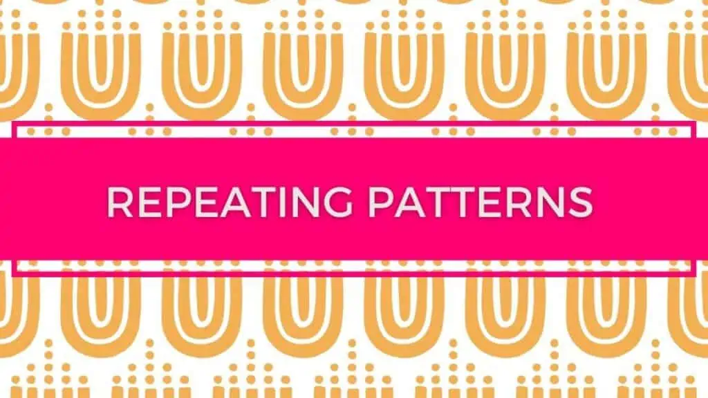
The concept of repetition in design has been discussed for many years. The term was first used to describe the use of a similar pattern or motif across multiple elements within an object, such as the repeated use of geometric shapes on a building facade.
The idea behind this approach is that it helps to make the overall design more coherent and memorable. For example, if you were designing a logo for a company, you might choose to repeat certain symbols throughout the design. These could include circles, squares, triangles, or any number of other shapes. By repeating these shapes, you help to reinforce the message that the company stands for stability and reliability.
In web design, repetition is often used to create a consistent feel across different pages. This consistency allows visitors to quickly identify the page they’re looking at. If all the links on a particular page are blue, for instance, then it’s much easier to spot the link that takes them back home than if the links had different colors.
There are two main types of repetition in web design:
1) Repetition of color, shape, size, and position
2) Repetition of structure (elements like headings, paragraphs, lists, etc.)
When choosing which type of repetition to use, we need to consider the following factors:
1) Does it add value to the design?
2) Will it distract users from accessing important parts of the page?
3) How does it affect readability?
4) How does it affect accessibility?
5) Is it appropriate for the content of the page?
6) Can it be done without using images?
7) Is it visually interesting?
8) Does it fit with the rest of the site?
9) Is it aesthetically pleasing?
10) Are there any special considerations?
For example, if we’re creating a navigation bar, we can use a simple line of text to label each button. But if we wanted to create a menu that included sub-menus, then we would need to use some sort of image.
We’ll talk more about the various ways to incorporate repetition into your designs later in this course.
How To Use Repeating Patterns On A Webpage
We’ve talked about the benefits of using repetition in web design, but how exactly do we go about doing it? Well, it depends on the situation. Let’s take a look at three common situations where we might want to use repetition.
First, let’s say that we’re redesigning a website and we want to give the homepage a unique look. One way to achieve this goal would be to use a repeating pattern on the background.
Second, let’s assume that we’re redesigning an eCommerce store and we want to highlight the products that are currently featured on the homepage. We could use a repeating pattern on top of the current product photos.
Third, imagine that we have a new section on our homepage called “About Us.” In order to separate this information from the rest of the page, we could place a repeating pattern between the About Us heading and the rest of the page.
What is Visual Hierarchy?
Visual hierarchy refers to the order in which we perceive information. It’s an important concept because it helps us understand how our brains process visual stimuli, and what that means for design.
In this article, I’ll explain what visual hierarchy is, why it matters, and how to apply it to your own designs.
The human brain is very good at processing visual information. We’re able to recognise objects and identify patterns quickly simply by looking at them. Our eyes move around the scene, constantly scanning the environment for new information.
When we notice something interesting, we tend to stop moving and focus on it. In other words, we become aware of it.
This is known as selective attention.
The problem is that our eyes don’t always work together effectively. Sometimes, our eyes may be focused on two or more items simultaneously. This creates confusion and uncertainty about what’s really going on.
To solve this problem, our brains have developed an automatic system that works out which object is most important.
It does this by assigning priority to each item based on its position in space.
For example, the closer an object is to the centre of the screen, the higher its priority. Objects further away receive lower priority.
This is known in psychology as ‘visual precedence’.
We use visual precedence to determine what we pay attention to first.
If we see a person standing next to a car, we’re likely to look first at the person.
If we saw a person standing next to the same car but with a dog sitting beside him, we’d probably look at the dog first.
Our brains do this automatically without us having to think about it.
But if we want to influence the way people think, we can use visual hierarchy to guide their perception.
How Does Visual Hierarchy Work?
There are three main ways in which visual hierarchy affects our perceptions:
- We prefer to look at things that are close to the centre of the image.
- We prefer to look up and down rather than left and right.
- We prefer to look towards the middle of the image.
These rules of visual precedence affect our ability to detect changes in images.
They also affect our ability to make sense of complex scenes.
So, when we look at images, we tend to focus on objects closest to the center of the picture.
And we tend to ignore objects furthest from the center. When we’re looking for something specific, we often scan the whole scene very quickly. We then stop scanning once we find what we’re looking for. This means that we only ever see part of the image at any given time.
The more important or interesting parts of the image are always near the center.
Visual Hierarchy Helps Us Detect Changes In Images
As well as helping us locate objects in pictures, visual hierarchy helps us spot changes in images too.
For example, if someone walks into frame, we’ll usually be able to tell straight away whether they’re a new character or an old one.
It’s because we have a preference for looking at things closer to the center of the screen.
If we don’t recognize them, we may assume that they’re new characters. But if we do recognize them, we might assume that they’re returning characters.
Because we like to look at things closer to the middle of the image, we can’t easily tell how many people are in the room unless we actually count them. We can’t tell how big the room is unless we measure it. And we can’t tell where the walls are unless we walk around them. All these things require us to move our eyes around the image.
This leads us back to the idea of visual precedence. If we want to understand the world around us, we need to pay attention to all the different elements within it. Each element has its own importance. We need to learn about each one individually before we can make sense of the whole.
To really understand the world around us requires us to look at everything. Our brains are wired to detect changes in scenes. We can’t help but notice things that are changing.
Our brains are constantly comparing the current state with the previous state. They compare the two states and decide which one is better. If the difference isn’t great enough, they use their memory to fill in the gaps. If the difference is large enough, they discard the information from the previous state and start again.
What is Structure In Design?
Structure in design is the process of organizing content into a logical, coherent and consistent manner. It’s about creating an overall structure that makes sense to users and helps them navigate your website or application easily. This includes things like:
- Page layout
- Navigation
- Content organization
- Typography
- Color
- Layout
- Organization
- Readability
- Visual hierarchy
- Contrast
- Scale
- Positioning
- Alignment
- Typographic Elements
- Text
- Font
- Weight
- Style
- Size & Space
- Typeface
- Line Height
- Margins
What Is Composition In Graphic Design?
Composition is the art of arranging and designing elements in a way that makes sense to the viewer. It’s not just about making things look good; it’s also about making them work for the purpose they are being used for.
Composition is about balancing form and function.
In other words, composition is about using design elements in ways that create balance between what you want to achieve and what works best.
- This means thinking about the following questions:
- What does this part of the page mean?
- How will I use this part of the page?
Does this piece of text fit well with the rest of the page?
How To Use Composition
Here are some tips on how to use composition effectively.
- Balance: Balance is achieved by having equal weight given to each component. If there are too few items, then the reader won’t be able to get a clear picture of what’s going on.
- Hierarchy: A hierarchy is created when the most important parts of the page are placed first.
- Repetition: Repetition is useful because it allows the eye to know where to go next.
- Movement: Movement creates interest. When something moves, the brain automatically processes it as interesting.
- Symmetry: Symmetrical objects tend to draw more attention than asymmetrical ones.
- Proximity: Proximity is another tool that helps readers focus on certain areas of the page.
- Clarity: Clarity refers to the amount of detail needed to convey a message. Too much information can overwhelm the user.
- Focus: Focus is a key element in any design project. You need to make sure that all the components on the page have a specific purpose.
- Simplicity: Simplicity is about removing unnecessary details and keeping only those necessary to communicate the message.
- Order: Order is very important in design. It gives a feeling of control over the chaos.
- Rhythm: Rhythm is about repetition. It’s often used to give rhythm to a page.
- Unity: Unity is about bringing together different elements into one cohesive whole.
- Variety: Variety adds excitement to a design. It keeps people interested and prevents boredom.
- Balance: Balance is about achieving a perfect equilibrium between two opposing forces.
- Emphasis: Emphasis is about drawing attention to a particular area of the page.
- Interest: Interest is about adding variety to a design.
- Harmony: Harmony is about finding the right combination of colors, shapes, textures, etc., so that everything fits together nicely.
- Contrast: Contrast is about creating contrast between light and dark.
- Repetition: Repetitions help the eyes move around the page.
- Proportion: Proportion is about ensuring that the size of an object or group of objects doesn’t exceed the space available on the page.
- Color: Color has many effects on our emotions.
- Texture: Texture is about giving your designs a three-dimensional look.
- Space: Space is about making room for things.
- Shape: Shape is about grouping similar objects.
- Value: Value is about the darkness or brightness of color.
- Size: Size is about the relative importance of an item.
- Line: Line is about the way something is drawn.
- Pattern: Pattern is about repeating a shape or pattern throughout a design.
- Light: Light is about the illumination of an object.
- Depth: Depth is about the distance between the viewer and the subject.
- Mood: Mood is about the emotional state of the viewer.
- Perspective: Perspective is about how we see things from above or below.
- Composition: Composition is about arranging elements in such a way that they create a pleasing image.
- Visual Flow: Visual flow is about the movement of the eye through a design.
- Movement: Movement is about the way things are moving.
- Motion: Motion is about the speed at which something is happening.
- Time: Time is about the passage of time.
- Dimension: Dimension is about the length, width, height, depth, and thickness of an object.
- Symmetry: Symmetry is about having equal parts on both sides of a line.
- Placement: Placement is about where you place items on a page.
What is Perspective In Graphic Design?
The perspective of a picture tells us what part of the scene is being depicted. A camera can be placed anywhere, but it will always show the same view of the scene. Here’s an example: If I were standing next to my desk, I could take a picture of myself sitting at my desk with my feet up on the chair. This would be a vertical view of me sitting at my desk. But if I stood behind my desk and took a picture of myself, I’d get a horizontal view of me sitting at the desk. Now let’s say I was standing next to my desk and took a photo of the desktop itself. That would give me a “bird’s eye” view of my desk. And if I moved away from the desk, I’d have a bird’s eye view of the whole room. So, perspective is all about showing different views of the same scene.
How Do We Use Perspective in Graphic Design?
We use it when we want to make our viewers feel like they’re looking into a scene as though they were there themselves. For instance, if you wanted to draw a picture of yourself sitting at your desk, you might start by drawing a box around your head and shoulders. Then you’d add lines going out from your head and shoulders to your arms, legs, and toes. You’d also add lines going down from your head and shoulders so that you looked like you were sitting at your desk. When you drew these lines, you created a perspective. It looks like you’re sitting at your desk.
How Can We Use Perspective in Our Designs?
We can use perspective in many ways. Let’s look at some examples.
- To Make Things Look Bigger
- If you put two people side-by-side in a small space, they’ll probably appear smaller than they really are. By using perspective, you can make them seem bigger.
- To Show How Far Away Something Is
- If you’re designing a poster for a concert, you can use perspective to make it look like the audience is far away.
- To Make Objects Appear Smaller
- When you draw a picture of someone sitting at a table, you can use perspective so that he appears smaller than the table.
- To Create Depth
- You can use perspective to make objects appear closer together or farther apart.
- To Draw Attention to One Object Over Another
- When you use perspective, one object will appear larger than another. This makes it easier for the viewer to notice the object that you want him to focus on.
- To Help Your Viewers See What They Are Looking At
- If you want your viewers to see something clearly, you can use perspective.
- To Give People a Feeling of Being There
- If you want your readers to feel like they’re actually inside the scene you’ve drawn, you can use perspective in your drawings.
- To Help Readers Understand Where They Are
- If you’re writing a story, you may need to use perspective to help readers understand where they are in the story.
- To Distinguish Between Two Different Views
- Sometimes you may want to create two different perspectives of a single image. For example, if you’re creating a map, you might want to display both a top-down view and a side-view.
- To Add Interest
- Sometimes you may want to use perspective to add interest to your designs.
- To Help Readers Remember Places
- If you’re writing about places, you may want to use a perspective to help readers remember where they are.
- To Help Readers Recognize Objects
- If you’re writing an article about a particular subject, you may want to show pictures of things related to that subject.
- To Help Readers Feel Like They Know Someone
- If you’re writing an article, you may want to include a person’s photograph.
- To Make Objects Seem Closer Together
- If you’re writing something about science, you may want to draw diagrams showing how atoms work.
- To Help Readers Recognise Faces
- If you’re writing articles about famous people, you may want to have their faces included.
What is Motion in Online Design?
Motion in online design can be defined as the movement of objects, people or other elements on a website. It’s one of the most important aspects of web design and it has been used to create some pretty amazing effects. Here are 15 examples of motion in online design:
- An animation effect that shows a user moving from page to page
- A video with a scrolling background
- A slideshow of images
- A series of videos that play automatically
- A sequence of photos that move across a screen
- A sequence of text that scrolls down a page
- A series of images that change over time
- A series of links that open up when clicked
- A series of animations that scroll through a page
- A series of words that move across a page
- A series of videos with music playing in the background
- A series of images with sound
- A series of images changing every few seconds
- A series of images, each one representing a step in a process
- A series of images showing a process
How Do I Create Motion Effects?
What Can I Use To Make Motion Graphics? + How Do I Add Animation To My Video?
You can use many different tools to animate videos. Some of these tools are listed below.
If you want to make something really special, then you’ll need to invest time into learning new software.
There are tons of different ways to make motion graphics. They range from simple techniques to complex animation systems.You don’t necessarily need special software to create these kinds of effects. In fact, there are many free tools available for you to try out. Some of them even come preinstalled on your computer.
Here are just a few of the best ones:
- Adobe Flash
dobe Flash is probably the most popular tool for creating motion effects. You can find tutorials all over YouTube and elsewhere. If you’re looking for inspiration, check out this collection of Flash animations.
- AfterEffects
AfterEffects is another great tool for creating motion graphics. There are plenty of resources online to teach you how to use it effectively.
- Canva
Canva is a user-friendly web software tool that can also create motion graphics easily.
- GIMP
GIMP (GNU Image Manipulation Program) is a powerful free program that lets you create lots of cool effects. Check out this tutorial to learn more.
- Photoshop
Photoshop is also a very useful tool for creating motion graphics, but it requires a lot of practice before you get good at using it. This tutorial will give you a basic idea of what you can do with Photoshop.
- Illustrator
Illustrator is a great tool for making vector graphics. But if you’re not familiar with it yet, it might take you a while to figure out how to make things look right. This tutorial will show you how to make simple shapes and lines.
- Dreamweaver
Dreamweaver is a popular web development tool which includes a built-in motion editor. You can use it to add motion effects to any HTML document.
- Fireworks
Fireworks is a web design tool that’s similar to Photoshop and Illustrator. It’s not as easy to use as those programs, but it does have its own set of features. You can read about them here.
- Google Chrome
Google Chrome comes with an integrated motion editor called “Animation.” You can find a short tutorial on youtube.
- Microsoft PowerPoint
Microsoft PowerPoint is a common presentation tool. It doesn’t include a dedicated motion editor, but you can still apply effects like fading between slides.
- Paint Tool SAI
The Paint Tool Sai is a free photo-editing application. It includes a motion editor too. Here’s a video tutorial that shows you how to use it.
What Is Texture in Graphic Design?
Texture is a visual element that creates depth and dimension. It can be used to create the illusion of three-dimensionality, as well as adding interest to your design. The texture you choose should complement the overall look of your graphic design.
How Do I Create A Text Effect?
Text effects are one of the easiest elements to create. All you need is some text and a background image. Then you can edit the text to suit your needs.
What is Form In Graphic Design?
Form in graphic design is a way to make your work more interesting and engaging. It can be used as an element of composition, or even as the main focus of your piece. The idea behind form in graphic design is that it helps you tell a story.
What is Space In Graphic Design?
Space in graphic design refers to the amount of visual information that a viewer can take in at one time. The more space there is, the easier it is for them to process and understand what they are looking at. This means that less space makes it harder for viewers to understand.
What Is Color Theory In Graphic Design?
Color theory in graphic design is all about understanding color and how it affects our emotions. By applying this knowledge, you can come up with designs that are more effective and appealing.
What are Gradients in Graphic Design?
Gradients are a type of color transition that is used to create the illusion of movement. They can be created by using different colors, or they can be created by blending two colors together, creating a gradient effect. The most common types of gradients include:
- Linear Gradient
- Radial Gradient
- Directional Gradient
- Interpolated Gradient
What is Typeface in Graphic Design?
Typefaces are the fonts used to create a design. They can be found on websites, printed materials and even mobile apps. The most common typefaces include Arial, Helvetica, Times New Roman and Verdana.
What is Symmetry In Graphic Design?
Symmetry is a fundamental concept in the world of graphic design. It can be used to create balance, harmony and unity within an image or layout. The most common forms of symmetry are radial, axial and bilateral.
What is Composition in Graphic Design?
Composition is the arrangement of objects on a page. It is often used to create balance and rhythm. When composing images, you should try to keep things simple, but not too plain. You should also avoid making everything look like a photograph.
What is Balance in Graphic Design?
Balance is the act of having equal amounts of positive and negative space in a design. If you have too much positive space, it will feel overwhelming. Too much negative space will leave your design feeling empty.
What is Rhythm in Graphic Design?
Rhythm is the repetition of elements in a design. It creates a sense of flow and motion. For example, if you want to create a sense of movement, use a repeating pattern such as stripes, dots, lines or circles.
What is Movement in Graphic Design?
Movement is the change over time of something. For example, when you read a story, you move from beginning to end. This is called linear movement. However, there is another form of movement that occurs when you watch a movie or listen to music. This is known as non-linear movement.
What is Perspective in Graphic Design?
Perspective is the way that we see things. We tend to focus on what is closest to us, while ignoring anything farther away. As you draw or paint, you need to think about where the viewer will be standing and how far away they will be looking at the object.
What is Proportion in Graphic Design?
Proportion is the relationship between parts of a design. It refers to the size of one element compared to another. For example, if the text is larger than the background, this would make the text appear out of proportion.
What is Scale in Graphic Design?
Scale is the distance between two points. For example, if a person is 5 feet tall, then their height is 1 unit of scale. If a building is 100 feet high, then its height is 10 units of scale.
What is Color Theory in Graphic Design?
Color theory is the study of how colors affect our emotions. There are many theories about which colors work best for certain situations. Some believe that red works well for happiness, orange for energy and blue for calmness.
What Is Texture in Graphic Design?
Texture is the surface quality of an object. Textures can range from rough to smooth. Smooth textures are usually more commonly seen in nature, while rough textures are more commonly found in manufactured products.
What is Value in Graphic Design?
Value is the lightness or darkness of an area of color. A value scale goes from 0 (black) to 255 (white). Black has no value, while white has maximum value.
What is Contrast in Graphic Design?
Contrast is the difference between two colors. One-color may seem lighter than another, even though they both have the same value. In order to create contrast, you must choose different values for each color.
What are Complementary Colors in Graphic Design?
Complementary colors are those that are opposite each other on the color wheel. They are always used together because they cancel each other out. For example, green and magenta are complementary colors because they are opposite each other on a color wheel.
What is Analogous Colors in Graphic Design? What is Monochromatic in Graphic Design?
Analogous colors are similar colors next to each other on the color spectrum. These colors are often used together because they complement each other. For example, yellow and orange are analogous colors because they are adjacent to each other on the rainbow. Monochrome means having only one color. For example, black and white are monochromes.
What is Polychromatic in Graphic Design? What Is Symmetrical in Graphic Design?
Polychromatic means having multiple colors. For example, a sunset is polychromatic because it contains all of the colors of the rainbow. Symmetrical means that something appears the same when viewed from either side. For example, a circle looks symmetrical when viewed from any angle.
Summaries of Core Graphic Design Basics
What is Metaphor in Graphic Design?
Metaphors are images that represent ideas by using words instead of pictures. For example, the word “love” could be used as a metaphor for marriage.
What is Calligraphy in Graphic Design?
Calligraphy is the art of hand-writing letters. It’s also known as handwriting.
What is Layout in Graphic Design?
Layout refers to the arrangement of elements within a page. Elements include headings, paragraphs, lists, photos, graphics, etc.
What Is Visual Hierarchy in Graphic Design?
Visual hierarchy is the way that we organize things visually. We put important items at the top of a page and less important items lower down.
What Is Color Theory in Graphic Design?
Color theory is the science behind choosing colors. It involves understanding what colors make us feel good, what colors work well together, how colors affect our moods, etc.
What Are Principles of Good Graphic Design?
Principles of good graphic design are rules that help designers create effective designs. There are many principles of good graphic design.
What Is Semiotics in Graphic Design?
Semiotics is the study of signs. Signs can be anything from language to symbols to objects.
What Is Typographic Style in Graphic Design?
The typographic style is the overall look of a piece of writing or artwork. A designer may choose a particular font, size, weight, etc. to achieve a specific effect.
